Website Case Study
Websites by WCMS, Version 4 (Dark)
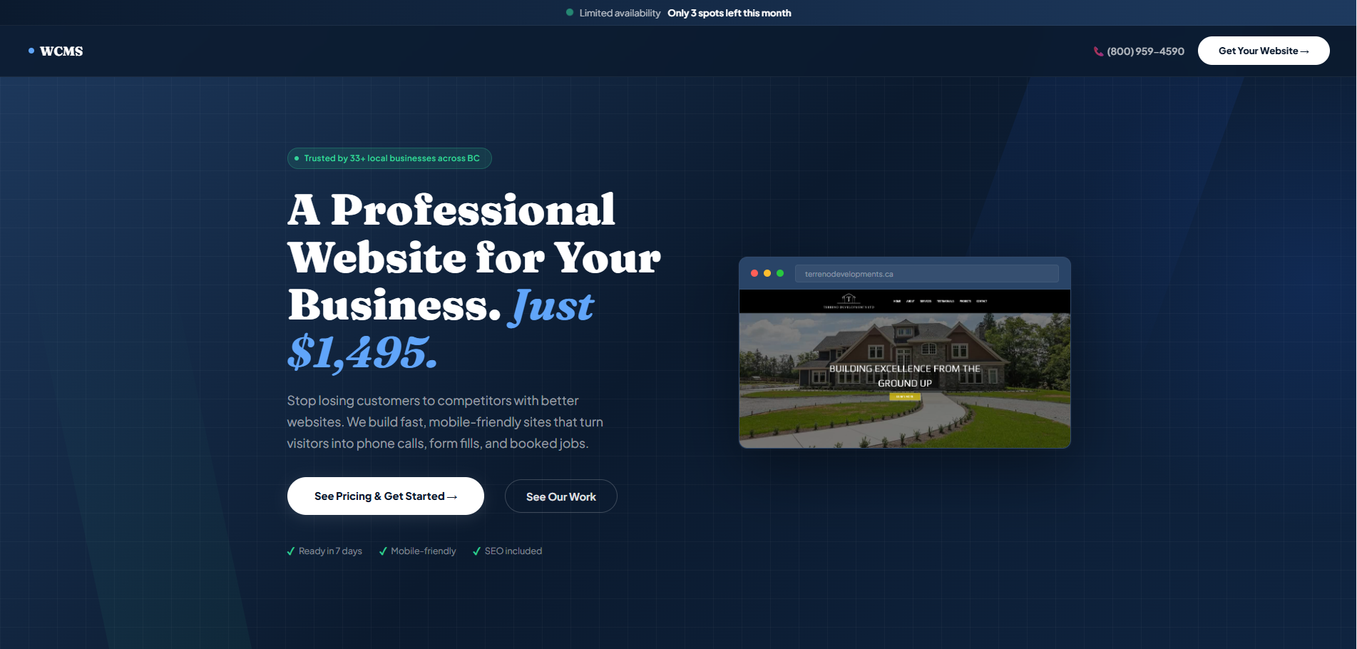
Deep navy, white type and a fixed-price custom website offer: the dark edition of our Version 4 landing page for trades and local service businesses.
At a Glance
Websites by WCMS is our own landing page funnel for selling websites to trades and local service businesses, aimed at owners in the United States and Canada. Version 4 is one iteration of its A/B tested design, and this is the dark variant. Over nine sections it covers what every site includes, a comparison with the alternatives, our work, reviews, a three-step process, project packages with Stripe checkout and an FAQ.
- Project
- Website
- Sector
- Web design services: our own sales funnel
- Scope
- One-page funnel in nine sections, dark theme
- Highlights
- Three-way comparison, packages, Stripe checkout
- Live site
- WebsitesByWCMS.com
The Brief
Trades owners looking for a website tend to weigh doing it themselves, hiring the cheapest freelancer or paying for a custom build. Version 4 had to make the custom build the obvious choice, then make buying it simple.
- State in one headline that the site is professional and built for the visitor's own business.
- Lay out what every site includes before asking for anything, from mobile-first design to SSL security.
- Set our custom build beside DIY builders and cheap freelancers so the difference is plain.
- Take a ready buyer from describing their business to a package and an integrated Stripe checkout.
What We Designed
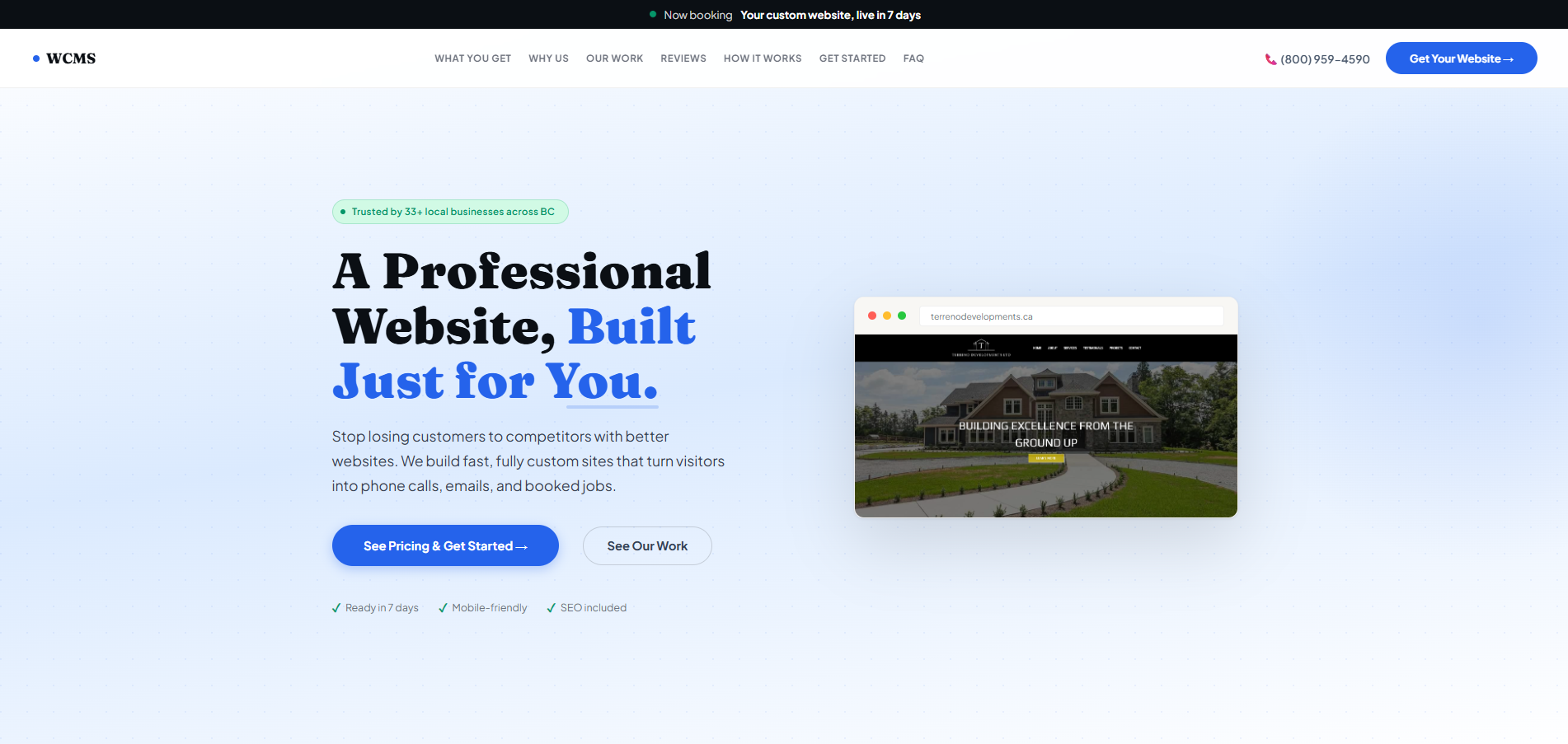
Version 4 Dark runs on a deep navy background with white headlines, pale blue-grey body text and white buttons, so the calls to action stand out sharply against the dark ground. The headline, A Professional Website, Built Just for You, is set in Fraunces for a confident editorial voice, while Plus Jakarta Sans keeps the feature copy and the comparison crisp and easy to scan.
A trust line about local businesses across BC sits above the headline, and a short promise about turning visitors into calls, emails and booked jobs sits below it, with two buttons: see pricing and get started, or see our work. A strip of four credentials follows (years of experience, projects delivered, custom built, average delivery), giving the claims some weight before the selling starts.
Six essentials
Mobile-first design, speed, built-in SEO, click-to-call, a contact form and SSL security, each explained in a line or two.
Three-way comparison
Our custom build side by side with DIY builders and cheap freelancers, with ticks and crosses doing the arguing.
Three simple steps
Tell us about your business, we design and build, then launch and start getting leads.
Packages and checkout
Project packages with clear pricing lead into an integrated Stripe checkout for visitors ready to buy.
How We Achieved It
Technically, the page is a single HTML file. Its top navigation links every section and carries a toll-free number and a Get Your Website button, so calling or buying is never more than one step from the top of the page. The Start Your Project section opens with one question about the visitor's business, answered from a dropdown, before the packages and checkout.
Each section answers one objection in turn: what you get, why us rather than the alternatives, proof in our work and reviews, then how it works. The FAQ handles the remaining doubts before a final Ready to Get Started prompt, and the footer gathers the privacy, cookie, legal, accessibility and terms pages. This dark variant is one iteration of our A/B tested funnel.
Keep Exploring
More Case Studies
Want a Website Like This?
Let's talk about what your business needs, or start with a custom five-page website for $49 US a month.