Website Case Study
Stunning Montana
Big Sky Country on one page: our own Montana guide pairs the pull of the landscape with trail facts a hiker can plan around.
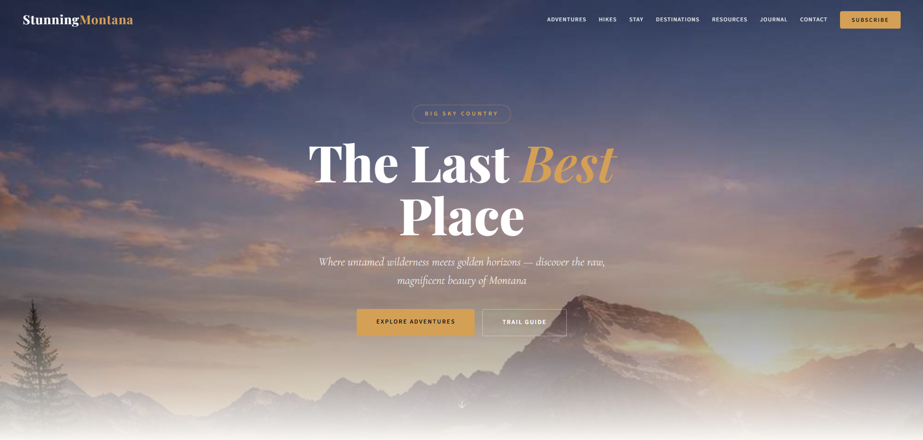
At a Glance
This Montana travel guide is one of our own sites, covering Big Sky Country from Glacier National Park to the Yellowstone region. A single long page moves from adventures such as fly fishing and river rafting to six Glacier trails, six luxury lodges and ranches, a journal, top destinations, travel resources and a FAQ. Journal stories and the legal policies open as overlays, and a contact form and newsletter signup close the page.
- Project
- Website
- Sector
- Travel and tourism: Montana and Big Sky Country
- Scope
- Single-page guide with overlay articles
- Highlights
- Trail cards, ranch stays, journal overlays
- Live site
- StunningMontana.com
The Brief
We wanted Montana to feel both wild and plannable. The guide had to sell the scale of Big Sky Country, then give a traveller the hard details a trip depends on.
- Open on the landscape, then offer two clear routes in: the adventures or the trail guide.
- Give every Glacier National Park hike its difficulty, distance, elevation gain and typical duration on the card itself.
- Present ranch resorts, destinations and travel resources so a reader can plan a whole trip in one place.
- Let long-form journal stories open in place, so reading never pulls anyone off the page.
What We Designed
The page opens on a hero image and the headline Montana: The Last Best Place. Beneath it, a strip of figures sets the scale, from square miles of wilderness to miles of Glacier trail and the named glaciers that remain. Adventures come next, from blue-ribbon fly fishing and Big Sky skiing to wildlife safaris, river rafting and horseback riding, then the trail guide, lodges and ranches, journal stories, destinations, resources and a FAQ.
We set headlines in Playfair Display, accents in Cormorant Garamond and reading text in Source Sans 3, so the guide reads like a well-made travel magazine. A warm ivory background, slate text and a golden amber for buttons pick up the golden horizons promised in the hero, and leave the landscape photography in charge. Every trail card leads with a difficulty label, easy, moderate or hard, so a family and a seasoned hiker can each find the right walk quickly.
Trail cards
Six Glacier National Park hikes, each showing its location in the park, round-trip distance, elevation gain and typical duration.
Ranch and lodge stays
Six luxury properties, from The Resort at Paws Up to Triple Creek Ranch, set out as a shortlist worth comparing.
Journal overlays
Long reads, such as a Glacier National Park primer and a photographer's guide to golden hour, open over the page.
Travel questions answered
A Montana FAQ and a travel resources section cover the practical questions that come before booking.
How We Achieved It
The guide is a single self-contained page, built to our consistent standard. Its navigation jumps straight to adventures, hikes, stays, destinations, resources, the journal, the FAQ and contact. Journal stories open as on-page overlays, and so do the five legal policies, so a reader can dip into detail and come back to exactly the spot they left.
Visitors can send a question through the contact form or join the newsletter, and both forms are protected against spam with Google reCAPTCHA. Behind the scenes, the page carries a meta description, JSON-LD structured data and a 1200 by 630 Open Graph image, so a shared link to the guide arrives with a proper preview, and the copyright year rolls over on its own each January.
Keep Exploring
More Case Studies


Want a Website Like This?
Let's talk about what your business needs, or start with a custom five-page website for $49 US a month.