Website Case Study
Amazing Cars
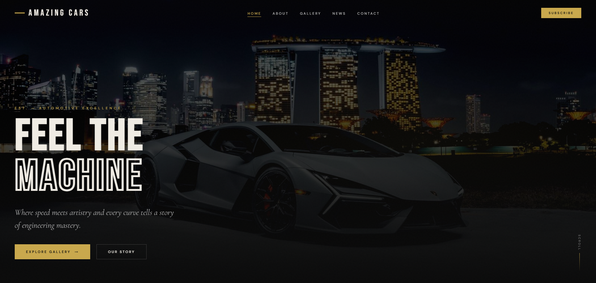
A dark, magazine-style home for supercar, classic and hypercar enthusiasts, with the drama of a car reveal on the very first screen.
At a Glance
Supercars, classics and hypercars are the beat of Amazing Cars, an automotive enthusiast site covering exotic and luxury vehicles worldwide. We designed a dark, magazine-style homepage with a hero, an about section, a curated gallery, dated industry news and a subscribe panel, backed by a full gallery page, an articles index, feature articles on their own pages and a contact page.
- Project
- Website
- Sector
- Automotive: enthusiast magazine
- Scope
- Multi-page site: gallery, articles and contact
- Highlights
- Category band, curated gallery, dated news
- Live site
- AmazingCars.net
The Brief
People who love exceptional cars want to feel them before they read about them. The design had to deliver that charge on the first screen, then reward a longer look with a gallery and in-depth articles.
- Make the first screen feel like a car reveal, with a bold headline and a clear route to the gallery.
- Signal the full range of coverage, from classics to hypercars, before anyone scrolls far.
- Give each feature article its own page, so stories on hypercars, auctions and electric supercars can stand alone.
- Keep the gallery, news, contact and subscribe options one tap away in the navigation.
What We Designed
FEEL THE MACHINE, set in tall condensed capitals, is the first thing a reader sees, with a single line about speed meeting artistry and buttons for the gallery and the site's story. Beneath it, a band names the site's categories (supercars, classics, hypercars, concepts, luxury, racing, exotics and heritage), before the page moves into the about section, the curated gallery and a run of dated industry stories.
Bebas Neue gives the display type the headline punch of a motoring magazine, Cormorant Garamond adds elegant accents and DM Sans handles the reading. The near-black background, warm ivory text and brushed gold buttons borrow from a showroom at night, where paint and chrome stand out against the dark. Nothing in the interface competes with the photography, so the cars always supply the colour.
Curated gallery
A homepage selection of cars leads to a full gallery page for anyone who wants to keep looking.
Dated industry news
Stories carry their month and year, from the future of hypercars to record classic car auctions, so readers can see what is current.
Standalone articles
The ten stories linked from the homepage, covering design philosophy, racing heritage, future mobility and more, each have their own page.
Contact and subscribe
A dedicated contact page and a subscribe section, both in the main navigation, give readers a direct line to the site.
How We Achieved It
We kept the homepage lean and let it act as a front cover: the gallery and news sections preview what lies deeper and link straight to it, with View All leading to the gallery and All Articles to the articles index. The feature articles sit on separate pages, which gives every story its own address to share and its own chance to be found in search.
Navigation stays short: home, about, gallery, news, contact and subscribe. The footer gathers the same routes, plus the privacy policy, legal notice, terms of use, cookie policy and accessibility information, beneath the site's motto about feeling the speed and loving the drive. Readers who want to get in touch have a dedicated contact page rather than a form buried at the bottom of the homepage.
Keep Exploring
More Case Studies
Want a Website Like This?
Let's talk about what your business needs, or start with a custom five-page website for $49 US a month.