Website Case Study
Fake News and Brews
A podcast site that reads like the front page of a retro tabloid, made for a Vancouver show that pairs the week's headlines with craft beer.
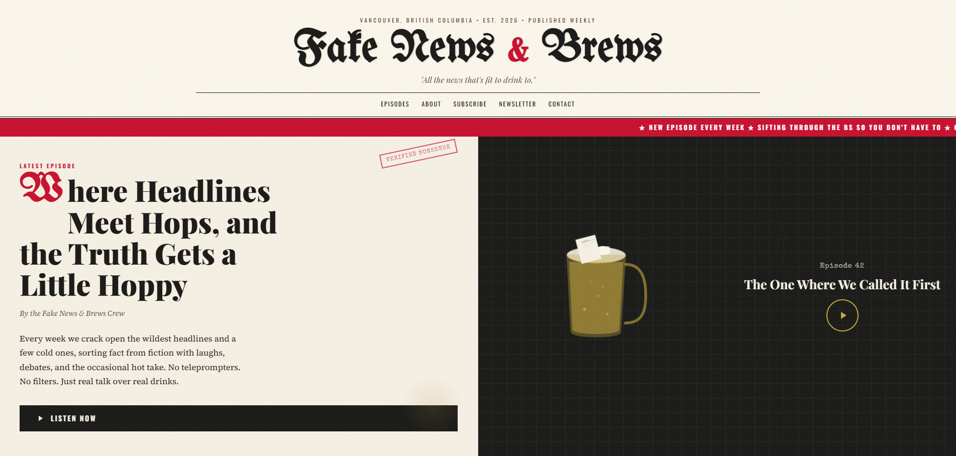
At a Glance
Every week in Vancouver, BC, the four hosts of Fake News & Brews pair news commentary with craft beer. We designed and built the show's single-page site in a retro tabloid style: a blackletter masthead, the latest episode as the lead story with a player, recent episodes set as headlines, an about section on the hosts, and ways to subscribe, join the newsletter or get in touch.
- Project
- Website
- Sector
- Media: news and craft beer podcast
- Scope
- Single-page site with episode archive and two forms
- Highlights
- Tabloid masthead, episodes as headlines, newsletter
- Live site
- FakeNewsAndBrews.ca
The Brief
A podcast that mixes headlines and beer needed a site with the same sense of humour. It also had to work as a practical hub for playing the latest episode, browsing older ones and subscribing.
- Get the show's personality across in the masthead, before a single episode is played.
- Feature the latest episode front and centre, with one clear button to listen.
- Make older episodes worth browsing, with titles, summaries, runtimes and dates.
- Collect newsletter signups and messages through forms that keep spam out.
What We Designed
The design direction is a retro tabloid newspaper crossed with a craft brewery. The show's name sits in a blackletter masthead under a dateline reading Vancouver, British Columbia, Est. 2026, Published Weekly, with the motto All the news that's fit to drink to. The latest episode runs as the lead story, complete with a Verified Nonsense kicker and a crew byline, and older episodes appear under Recent Headlines Worth a Pint.
Four typefaces share the work, as they would on a real front page. UnifrakturMaguntia gives the masthead its old-press blackletter, Playfair Display and Oswald handle headlines and labels, and Source Serif 4 keeps the episode write-ups easy to read. The palette is newsprint cream and ink black, and the footer signs off with a straight-faced pair of notes: please drink responsibly, please read critically.
Tabloid masthead
A blackletter nameplate, a dateline and a motto set the tone before anyone presses play.
Episodes as headlines
Recent episodes are laid out like front-page stories, each with a headline and a one-line hook.
Meet the hosts
Profiles of all four hosts put names to the voices on the show.
Newsletter signup
Get the Headlines in Your Inbox collects email addresses for the show's newsletter.
How We Achieved It
Episodes, About, Subscribe, Newsletter and Contact in the navigation each jump to their section of the single page. Every archived episode carries a number, a headline, a one-line summary, its runtime and its release date, which makes the archive quick to scan. The about section explains how the show grew out of years of friendship and a group chat, and Pour Yourself a Pint, Press Play points listeners toward subscribing.
Both forms, the newsletter signup and the contact form, are protected with Google reCAPTCHA and further checks, and the contact form keeps the tone by asking visitors to spill the beans. Structured data describes the show as a podcast series alongside the organization, website and page. The build also includes a favicon set, an Open Graph image, robots.txt, an XML sitemap and a skip-to-main-content link for keyboard users.
Keep Exploring
More Case Studies
Want a Website Like This?
Let's talk about what your business needs, or start with a custom five-page website for $49 US a month.