Website Case Study
Country Music Journal
Front-row coverage of country music, pairing long reads, reviews and artist profiles with a running ticker of the genre's news.
At a Glance
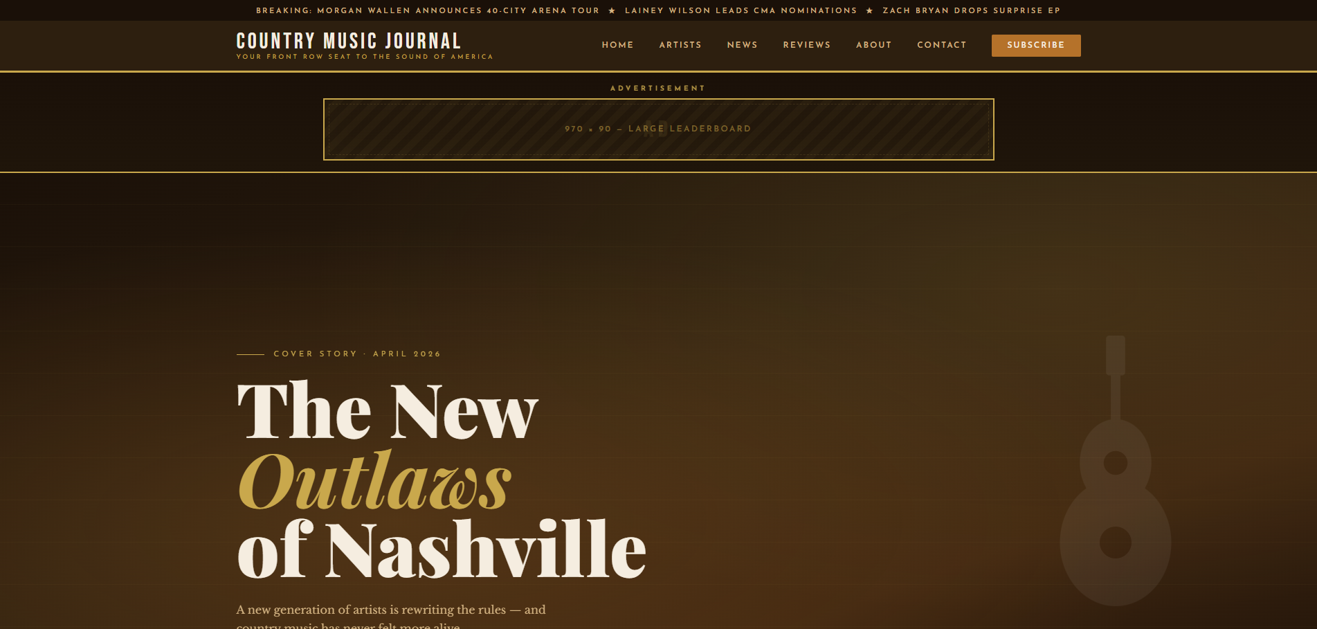
Covering country music news, artist profiles and album reviews, Country Music Journal is a West Coast Media Solutions content site that we designed as a single-file editorial publication. Three featured stories follow the lead headline, a ticker of artist news runs beneath them, and a spotlight of featured artists comes before the latest news and features. Articles and artist profiles open as overlays, so readers can go deep without leaving the front page.
- Project
- Website
- Sector
- Music and entertainment: country music
- Scope
- Single-file editorial site with overlays
- Highlights
- Artist profiles, news ticker, featured stories
- Live site
- CountryMusicJournal.com
The Brief
Country fans come for the stories behind the songs as much as for the headlines. The site needed the confidence of a magazine and the warmth of the genre, with room for interviews, reviews, history and new artists alike.
- Lead with in-depth features, interviews and reviews, the way a music magazine leads with its cover stories.
- Profile artists with their style and hometown, and open each full profile without leaving the page.
- Keep the latest artist news in view with a running ticker of headlines.
- Cover the breadth of the genre, from classic and outlaw country to alt-country and bluegrass.
What We Designed
Masthead first: the journal's name and its tagline, Your Front Row Seat to the Sound of America, sit above the lead headline, The New Outlaws of Nashville, and three featured stories labelled In Depth, Interview and Review, each with its date and reading time. A ticker of artist news (residencies, arena runs, new albums) scrolls between those stories and the Featured Artists spotlight, where every card carries a style tag such as Neo-Trad or Alt-Country and a hometown.
Three typefaces share the work: Playfair Display for the lead headline, with Josefin Sans and Libre Baskerville alongside, Josefin bringing the clean, slightly vintage geometry of an old concert bill. The palette is parchment, a deep brown that is almost black for text and a whiskey amber accent, warm colours that suit the genre without tipping into costume. Dates and reading times on the stories keep the voice that of a working music journal.
Featured stories
Three featured stories, labelled In Depth, Interview and Review, read like a magazine's cover lines.
Artist spotlight
Profile cards carry each artist's style and hometown and open a full profile in an overlay.
News ticker
A running line of headlines on tours, residencies and new albums keeps the latest news in view.
Contact by topic
A contact form with a topic menu lets readers say what they are writing about before they send.
How We Achieved It
Articles and artist profiles open as overlays, so a reader can go from the Grand Ole Opry's centenary to the history of the Bakersfield Sound and back without losing the front page. Every card in the Featured Artists spotlight has its own Read Profile link. The navigation (Home, Artists, News, Reviews, About and Contact) gives each kind of content a direct route, and Subscribe closes the menu.
The contact form includes a topic menu so readers can say what their message is about, and the site also offers a newsletter signup; both are protected against spam with Google reCAPTCHA. Five legal policies open as overlays from the footer, which also lists the genres the journal covers, from classic and outlaw country to Texas country and bluegrass. The copyright year updates itself, and structured data describes the journal to search engines.
Keep Exploring
More Case Studies
Want a Website Like This?
Let's talk about what your business needs, or start with a custom five-page website for $49 US a month.