Website Design Concept
Axis Insurance
Businesses, households and employers each get their own way in, while existing clients reach renewals, claims and payments in one click.
This is a design concept: a website we designed as a proposal for Axis Insurance. It was not commissioned, and West Coast Media Solutions is not affiliated with Axis Insurance.
At a Glance
Based in Vancouver, Axis Insurance is a brokerage serving clients across Canada and internationally in commercial, personal, and benefits and life insurance. We structured the concept as a single page that opens on Safeguarding the Exceptional, then runs through industry-specific commercial coverage, personal insurance, employee benefits, the brokerage's approach, insight articles and a closing Find Your Broker section, with a utility bar for existing clients across the top.
- Project
- Design concept
- Sector
- Financial services: insurance brokerage
- Scope
- One-page concept with seven sections
- Highlights
- Client utility bar, industry list, insight articles
- Concept
- View the concept
The Brief
A brokerage site serves two crowds at once: prospects shopping for coverage, and clients who just need to renew or file a claim. Both had to find what they came for without either getting in the other's way.
- Separate commercial, personal, and benefits and life coverage into three clear paths from the main menu.
- Show commercial depth through named industries, from technology and construction to aviation, energy and mining.
- Give existing clients renewals, claims, invoice payments and login in a utility bar above everything else.
- Build credibility with the brokerage's history and approach, plus practical articles under Stay Informed.
What We Designed
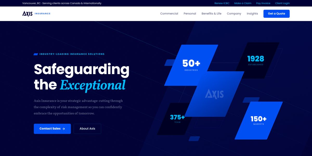
The top of the page splits audiences straight away: a utility bar offers Renew ICBC, Make a Claim, Pay Invoice and Client Login, while the main navigation names the three lines of business and ends in Get a Quote. The hero pairs Safeguarding the Exceptional with Contact Sales and About Axis buttons, followed by a short row of figures on industries served, year established, team size and markets.
We paired Poppins headings with the serif Vollkorn for a voice that is modern but grounded, on a clean white page with warm charcoal text and a vivid cobalt blue for calls to action. The commercial section presents eight industries, each with a one-line note on what it covers, from SaaS and robotics to surety bonding, and the personal and benefits sections follow the same compact pattern.
Client utility bar
Renew ICBC, make a claim, pay an invoice or log in, all from a bar above the main menu.
Industry coverage
Eight industries, from life sciences to small business, each with a short line naming the cover involved.
Personal and benefits
Home, condo, tenant and auto cover alongside employee benefits, retirement plans, executive benefits and life and disability.
Insight articles
Three articles on accident benefits reform, cyber breach planning and liability limits for technology companies.
How We Achieved It
Each line of business follows one pattern: a short label, a headline, a framing sentence and a set of specific options, so a reader who learns the layout once can scan the rest quickly. The industry list ends in View All Industries, which leaves room for the full range without crowding the home page.
Three principles under Refreshingly Different (a disciplined approach, deep expertise and people first) explain how the brokerage works without leaning on jargon. The insights section gives visitors a reason to return, and the page ends at Find Your Broker, putting people behind the brand. The footer lists commercial industries and personal products, with company pages and quick links alongside.
Keep Exploring
More Case Studies
Want a Website Like This?
Let's talk about what your business needs, or start with a custom five-page website for $49 US a month.