Website Case Study
Terreno Developments
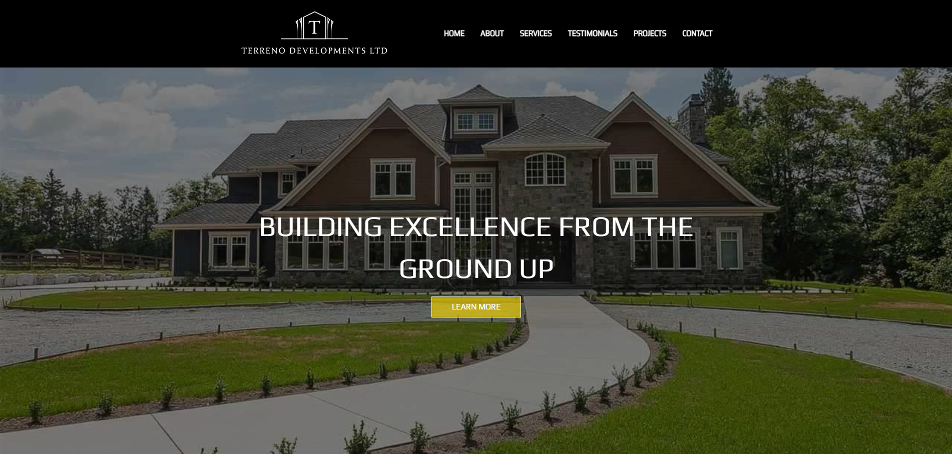
Built for a construction and development company, this website shows the full range of work, from concrete and carpentry to demolition and new builds.
At a Glance
Terreno Developments Ltd. is a construction and development company working on residential and commercial projects, demolition and renovations. We designed its website around the work: an introduction to the company, an overview of services with a dedicated page for each trade, testimonials, a gallery of previous projects and direct contact details. A blog archive on construction and real estate rounds out the project.
- Project
- Website
- Sector
- Construction and development
- Scope
- Multi-page site with service pages and a blog archive
- Highlights
- Six service pages, project gallery, blog archive
- Live site
- TerrenoDevelopments.ca
The Brief
A builder's website has to show capability at a glance: what the company does, what it has built and how to reach it. Terreno's range is wide, so the site had to cover every service without feeling scattered.
- Introduce the company and its residential and commercial focus before anything else.
- Cover six trades in depth without crowding the home page.
- Let finished work speak through a gallery of previous projects, alongside testimonials.
- Close with the address, phone number and contact details in one easy-to-find place.
What We Designed
Bright construction yellow carries the opening line, Building Excellence from the Ground Up. From there the home page moves through About Us, Our Services, Testimonials and Previous Projects before closing on the address, phone and contact details. The services overview introduces each trade in a few lines and leads to its own page, so the home page stays readable while every service still gets full coverage.
We paired Play, with its squared, engineered letterforms, and Saira Semi Condensed, a compact and sturdy sans, which together suit a company that pours foundations and builds from the ground up. The palette is plain on purpose: white space, black text and that single site-safety yellow, which reads like signage on a job site and keeps attention on the project photography.
Service pages
Each trade, from concrete foundations and driveways to full new construction, has a page with room to explain the work.
Previous projects
A gallery of past work shows the company's range in pictures rather than claims.
Customer testimonials
Feedback from customers sits between the services overview and the project gallery on the home page.
Blog archive
Posts written for every business day give the site depth on construction and the real estate markets around it.
How We Achieved It
Splitting the services into separate pages was the key structural decision. Concrete alone spans foundations, driveways, patios and walkways, which is more than a few lines on the home page can cover. With a page per trade, search engines get a clear, focused match for each service, while the home page keeps to short introductions. Legal notice and privacy pages complete the structure.
The project dates from October 2024 and was delivered on its original schedule. It also includes a blog archive with one post for every business day since then, covering construction broadly, real estate markets included, and following the same publishing approach as our own blog. An archive on that schedule gives the site fresh, relevant writing to sit beside the service pages.
Keep Exploring
More Case Studies
Want a Website Like This?
Let's talk about what your business needs, or start with a custom five-page website for $49 US a month.