Website Case Study
Kundert Consulting
Plain-spoken and free of hype, this website presents a Vancouver consultancy that helps small and medium-sized businesses grow, streamline and market well.
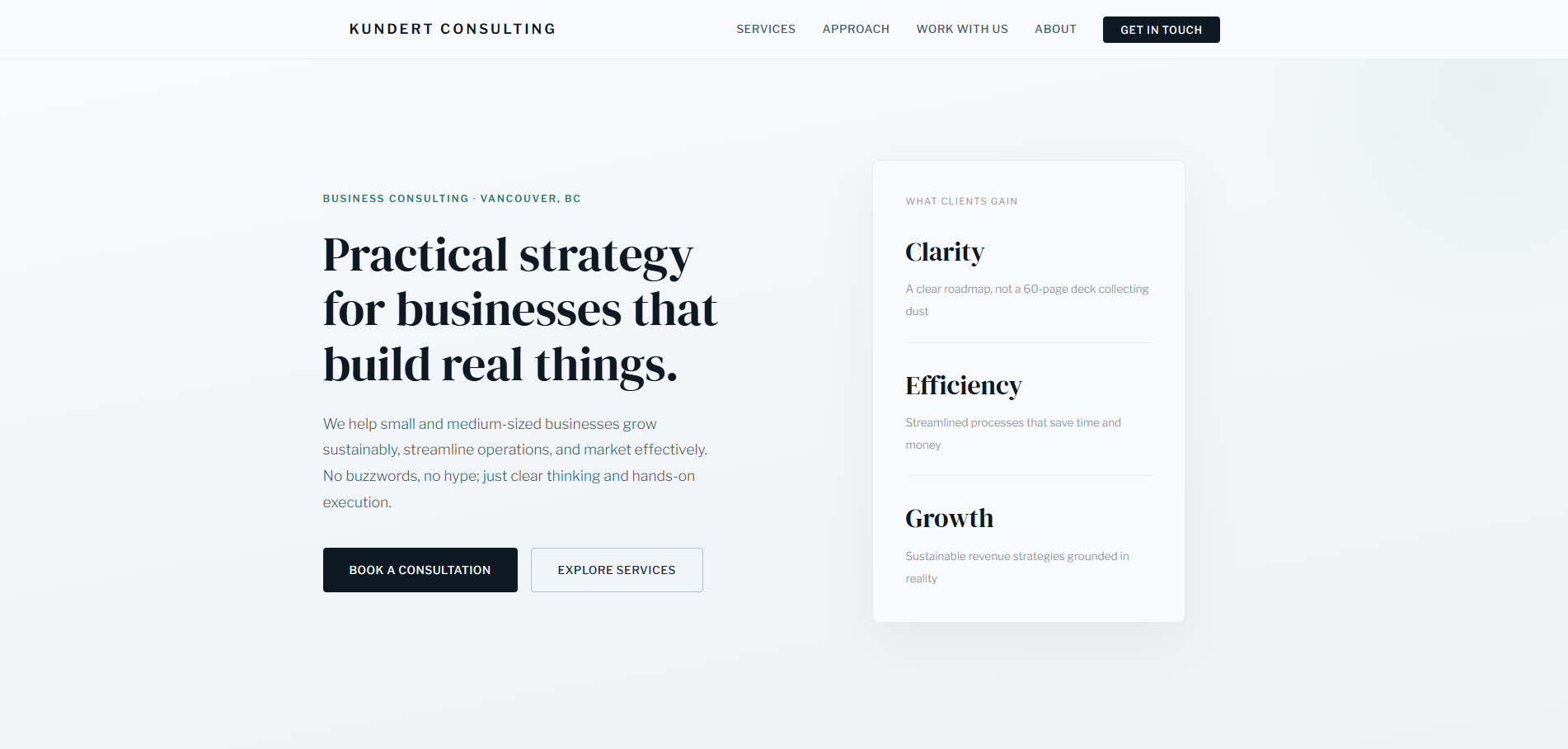
At a Glance
Vancouver-based Kundert Consulting helps small and medium-sized businesses with growth, process streamlining and marketing. We designed and built its website in a deliberately professional register, free of hustle-culture language. The single page moves from approach and services to the ways of working together, common questions and contact, and a booking overlay with a calendar and time picker takes appointment requests directly.
- Project
- Website
- Sector
- Professional services: business consulting
- Scope
- Single-page site with booking overlay and FAQ
- Highlights
- Six services, three engagement models, booking calendar
- Live site
- KundertConsulting.com
The Brief
Owners of small and medium-sized businesses have heard plenty of consulting pitches. This site had to sound like the opposite: measured, specific and serious about doing the work.
- Say plainly what the firm does and who it serves, without buzzwords.
- List six service areas so an owner can recognize their own problem among them.
- Set out the engagement options, from hourly coaching to ongoing advisory, without pressure.
- Take appointment requests directly, at a time that suits the visitor, Monday to Friday.
What We Designed
Practical strategy for businesses that build real things is the headline, under a Business Consulting, Vancouver, BC line and above buttons to book a consultation or explore services. Three outcomes follow (clarity, efficiency, growth), then the approach in three principles, six numbered services with their focus areas, the engagement options, how the work proceeds, common questions and a closing invitation to talk.
Headings are set in DM Serif Display for a composed, editorial authority, with Libre Franklin keeping the body copy clear and businesslike. The palette is deep navy and slate with a teal accent on a cool off-white, and it replaced an earlier warm earth and bronze scheme. The logo is set in capitals, and the favicon is a KC monogram: a white K and a teal C on navy.
Booking overlay
Visitors pick a weekday and a time on a calendar instead of trading emails to find a slot.
Six service areas
Strategy, operations, marketing, digital presence, financial clarity and leadership, each numbered with its focus points.
Engagement options
Hourly coaching, project-based work and ongoing advisory are presented together, so owners can compare them.
Plain-spoken principles
Substance over style, tailored not templated, and execution not theory set the tone for everything else.
How We Achieved It
The booking overlay is the practical heart of the site. It opens a calendar and time picker, takes appointment requests Monday to Friday between 7 AM and 7 PM Pacific, and collects a name, email, phone number, company and notes. For anything else, the contact form asks which service a visitor is interested in, and it is protected by Google reCAPTCHA together with further checks.
Engagements are presented as hourly one-on-one coaching, per diem project work or ongoing retainers, so an owner can choose how deep to go. The copy speaks in a measured third-person we throughout, and the services section ends with a prompt for anyone unsure which area they need. A meta description, structured data and an Open Graph image support search and sharing.
Keep Exploring
More Case Studies
Want a Website Like This?
Let's talk about what your business needs, or start with a custom five-page website for $49 US a month.