Website Design Concept
Aldesta Hotel Group
One brand page for six very different properties, from BC hot springs to Great Barrier Reef coral cays, designed to present a collection rather than sell a single room.
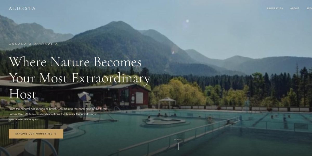
This is a design concept: a website we designed as a proposal for Aldesta Hotel Group. It was not commissioned, and West Coast Media Solutions is not affiliated with Aldesta Hotel Group.
At a Glance
Aldesta Hotel Group runs six hotels and resorts: four in British Columbia, from mountain hot springs to Harrison Lake, and two island resorts on Australia's Great Barrier Reef. Rather than a booking site, our concept is a parent-brand page: it introduces the group in a few lines, presents each property with a short portrait and its signature amenities, groups the collection by region and sends visitors on to each resort.
- Project
- Design concept
- Sector
- Hospitality: hotel and resort group
- Scope
- One-page brand concept with five sections
- Highlights
- Six property portraits, region view, brand story
- Concept
- View the concept
The Brief
A hotel group asks guests to trust a collection before they choose a place. This page needed to make six very different destinations feel like one family, then pass each visitor to the property that suits them.
- Introduce a group that spans mountain hot springs and coral cays without the story feeling scattered.
- Give each of the six properties a short portrait, its signature amenities and a link onward.
- Let visitors browse by region as well as by property: British Columbia or the Great Barrier Reef.
- Keep the group's own story brief, so the destinations stay in the foreground.
What We Designed
We set the page on a near-black ground with ivory type and muted gold buttons, a quiet evening look that lets very different property images sit together as a set. The opening line, Where Nature Becomes Your Most Extraordinary Host, carries a single action: Explore Our Properties. Cormorant Garamond lends the headings a classic hotel elegance, and Jost keeps the property notes and amenity tags crisp.
A brief story section follows with the founding year and three figures: properties, countries and years in operation. The collection comes next under Six Destinations, Two Continents, where each property is introduced by its region, a short portrait and a row of amenity tags such as private hot springs, marina, ski hill or golf courses. A regions section completes the picture, splitting the portfolio between British Columbia and the Great Barrier Reef.
Property portraits
Each resort gets its region, a short description, amenity tags and a Visit Resort link.
Region view
British Columbia and the Great Barrier Reef shown as two halves of one collection.
Story in figures
Founding year, number of properties, countries and years in operation stated in one compact block.
Evening palette
Near-black backgrounds, ivory text and gold accents help six varied destinations read as one brand.
How We Achieved It
With only four menu items (properties, about, regions and contact), the navigation stays out of the way, because the main job of a group site is to route people well. Property cards end in an onward link, and the footer lists the Canadian and Australian properties in separate columns next to company pages for careers and press, giving job seekers and media a path of their own.
The portraits are kept distinct so no two properties sound alike: one leads with hot springs pools and year-round mountain recreation, another with private mineral pools, a marina and fine dining, and the reef islands with their coral cays. A descriptive title and meta description name both countries for search. We have also drawn separate concepts for each of the six properties in the collection.
Keep Exploring
More Case Studies
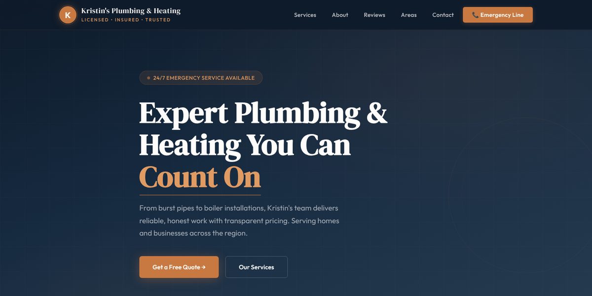
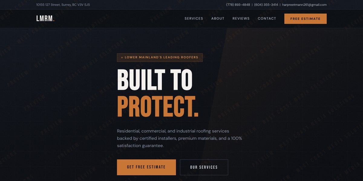
Want a Website Like This?
Let's talk about what your business needs, or start with a custom five-page website for $49 US a month.